


How to Create FOMO in Restaurant Marketing and Drive Immediate Reservations
July 10, 2025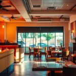
Why the Wrong Colors Could Be Hurting Your Restaurant Sales
July 11, 2025
As I walked into my favorite Italian restaurant last week, I was immediately struck by the warm, inviting atmosphere that made me want to linger over my meal. The rich tones of the decor and the soft lighting created a cozy ambiance that seemed to slow down time. But have you ever stopped to consider the science behind this feeling? Research shows that the strategic use of colors can significantly influence our dining experience, from the length of our stay to the amount we spend.
Did you know that certain colors can stimulate appetite, while others can promote relaxation? The power of color psychology in restaurants is more than just aesthetics; it’s a tool that can be leveraged to create specific atmospheres and influence guest behavior. By understanding the psychology behind different hues, restaurant owners can make informed design decisions that align with their business goals.
As we explore the world of restaurant color psychology, you’ll discover how the right color scheme can make guests stay longer, order more, and return more frequently. This comprehensive guide will walk you through the strategic implementation of color psychology in your establishment, directly impacting your bottom line. What if you could create a dining experience that not only delights your customers but also boosts your revenue?
Key Takeaways
- The strategic use of colors can influence dining duration and customer spending.
- Different colors can stimulate appetite or promote relaxation.
- Understanding color psychology can inform restaurant design decisions.
- The right color scheme can increase customer loyalty and revenue.
- Color psychology is a powerful tool for creating specific atmospheres.
The Power of Color in Restaurant Design
Restaurant design is not just about aesthetics; it’s also about leveraging the psychological impact of color. The colors used in a restaurant can significantly influence how customers feel and behave, ultimately affecting their dining experience.
How Colors Influence Customer Behavior
Colors can trigger specific neurological and psychological responses in customers, influencing their behavior. For instance, certain colors can stimulate appetite, while others can promote relaxation. By choosing the right colors, restaurants can encourage customers to stay longer, order more, or return sooner.
First Impressions and Setting Expectations
The colors used in a restaurant’s design create immediate visual cues that set customer expectations. Before customers even sit down, they can get a sense of the restaurant’s atmosphere, price point, and style. For example, a restaurant with a predominantly red color scheme may be perceived as energetic and lively, while one with a calming blue palette may be seen as relaxed and intimate.
By understanding the power of color in restaurant design, owners can make informed decisions to enhance the dining experience and achieve their business goals.
Understanding Restaurant Color Psychology
Restaurant color psychology is a crucial aspect of designing an inviting and effective dining environment. The colors used can significantly influence how customers feel and behave during their visit.
The Science Behind Color Perception
The way we perceive colors is rooted in neuroscience. Different wavelengths of light trigger various emotional and physiological responses in our brains. For instance, warm colors like red and orange can stimulate appetite, while cool colors like blue can have a calming effect. Understanding this science can help restaurant owners make informed design decisions.
- Colors are processed in the brain, influencing emotions and physiological responses.
- The color wheel categorizes colors into stimulants (red, orange, yellow), mild stimulants (green), and suppressants (blue, purple).
How Colors Affect Appetite and Dining Duration
Colors can significantly impact how long customers stay and how much they eat. For example, fast-food restaurants often use red and orange to stimulate appetite and encourage quick turnover. In contrast, fine dining establishments might use more subdued colors to create a relaxing atmosphere that encourages longer stays.
By understanding the effects of different colors, restaurant owners can design their spaces to achieve the desired customer behavior.
Light vs. Dark: Creating the Right Spatial Atmosphere
The interplay between light and dark colors in restaurant design plays a crucial role in shaping the spatial atmosphere and influencing customer behavior. The choice of color palette can significantly impact how customers perceive the space and their dining experience.
Opening Up Spaces with Light Colors
Light colors create an open and airy feel, making them ideal for breakfast and lunch establishments. By reflecting natural light, these colors can make a small space feel larger, creating a calm yet energetic ambiance. This atmosphere encourages customers to relax while remaining alert, potentially leading to healthier food choices.

Creating Intimacy with Dark Color Palettes
In contrast, dark color palettes can create a cozy and intimate atmosphere, perfect for evening dining. By absorbing light, these colors make a room feel smaller and more enclosed, fostering feelings of safety and comfort. This can be particularly effective for restaurants aiming to create a dramatic or romantic ambiance.
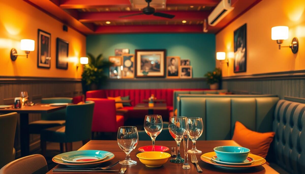
Appetite-Stimulating Colors: Red, Orange, and Yellow
The strategic use of red, orange, and yellow in restaurant design can significantly influence customer appetite and behavior. These colors are not only visually appealing but also have a profound effect on our psychological and physiological responses to food.
The Energy Booster: Red
Red is often described as the “hungriest color” due to its ability to draw attention and energize us, thereby stimulating our appetite. Studies have shown that red encourages people to eat more and consume food faster, especially when paired with yellow. This is why red is a dominant color in the foodservice industry, particularly among fast-food chains. The increased heart rate and energy levels associated with red make it an ideal choice for establishments seeking high turnover.
The Friendly Stimulant: Orange
Orange is another color that stimulates appetite, offering a friendlier alternative to red. It evokes an energetic emotional response while being perceived as a color that signifies good value. Orange creates a casual, welcoming atmosphere that works well for family restaurants and establishments aiming to balance turnover with comfort. Its ability to encourage impulse purchases makes it a valuable color in restaurant design.
The Happiness Inducer: Yellow
Yellow is associated with feelings of happiness, joy, and optimism, making it an excellent choice for creating positive dining experiences. The serotonin boost experienced in a yellow setting not only stimulates appetite but also enhances the overall dining experience. Both bright and pastel yellows are effective in inducing happiness and increasing food consumption.
In conclusion, the combination of red, orange, and yellow creates a powerful appetite-stimulating environment. These colors are widely used in fast-food and quick-service restaurant designs due to their ability to increase appetite and encourage faster eating. By understanding the impact of these colors, restaurants can design spaces that not only attract customers but also enhance their dining experience.
Balanced and Natural Colors: Green and Brown
The colors we choose for our restaurants can significantly influence how our guests feel and behave. Among the various hues, green and brown stand out for their natural and balancing effects.

Green: Promoting Health and Freshness
Green is associated with health, freshness, and natural foods, making it an ideal choice for restaurants focusing on organic or health-conscious menus. Different shades of green can evoke various responses, from vibrant greens that energize to softer greens that calm and relax. Incorporating green through plants or biophilic design can increase the perceived value of an establishment while promoting customer wellbeing.
Brown: Stability and Comfort
Brown tones create feelings of stability, reliability, and earthiness, making customers feel grounded and comfortable. While brown is generally considered an appetite suppressant, deep browns associated with rich flavors like coffee or chocolate can trigger specific cravings. Shades of brown also create an organic feel, reminiscent of the earth and natural materials.
By thoughtfully incorporating green and brown into their color schemes, restaurants can create a welcoming and natural ambiance that enhances the dining experience.
Appetite-Suppressing Colors: Blue and Purple
While red stimulates appetite, blue and purple have the opposite effect, acting as appetite suppressants in restaurant settings. These colors, though not typically associated with food, play significant roles in influencing diner behavior and appetite.
Blue is an appetite suppressant because it’s rarely found in natural food sources, with exceptions like blueberries and certain types of fish. However, blue inspires thirst, making it perfect for bars and establishments focusing on beverage sales. Its calming and intellectual properties encourage reflection and mental clarity, creating a relaxed atmosphere for certain dining concepts.
The Thirst Promoter
Blue is most often used in seafood restaurants and bars due to its association with water: fresh, soothing, and cool. Seafood restaurants can successfully incorporate blue by connecting it to oceanic themes while balancing it with appetite-friendly colors. For example, a seafood restaurant might use blue tones for decor and branding, evoking the freshness of the ocean.

| Color | Effect on Appetite | Best Use |
|---|---|---|
| Blue | Suppresses appetite, promotes thirst | Bars, seafood restaurants, beverage-focused establishments |
| Purple | Suppresses appetite, associated with luxury | Upscale restaurants, accent color for elegance |
Luxury and Complexity
Purple is an appetite suppressant that also inspires complex emotional responses due to its mix of red’s stimulation and blue’s calmness. It’s associated with nobility and luxury, making it ideal for upscale dining experiences. Use purple as an accent color or in muted shades to add elegance without suppressing appetite too dramatically. Bright purple lighting, however, is a popular choice for nighttime venues, adding a touch of sophistication and creativity.
In conclusion, blue and purple, while suppressing appetite, offer unique opportunities for restaurateurs to create distinct dining environments. By understanding their effects and applications, establishments can leverage these colors to enhance their brand and customer experience.
Strategic Color Schemes for Different Restaurant Types
A well-chosen color scheme is essential for restaurants to create an ambiance that aligns with their brand and purpose. Different types of restaurants require distinct color schemes to enhance the dining experience and influence customer behavior.
Fast Food and Quick Service Restaurants
For fast food and quick service restaurants, bright, warm colors like red, orange, and yellow are ideal. These colors stimulate appetite and increase table turnover, making them perfect for high-volume establishments.
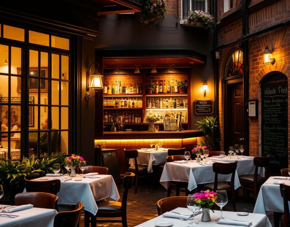
Fine Dining Establishments
Fine dining establishments benefit from sophisticated color palettes that create an exclusive atmosphere. Rich, elegant colors such as deep burgundy and gold accents on neutral backgrounds encourage appetite while maintaining luxury.
Cafés and Bistros
Cafés and bistros require color schemes that balance comfort with moderate turnover. Warm neutrals and soft greens with strategic pops of energizing colors achieve this balance, creating a welcoming environment.
Bars and Nightlife Venues
For bars and nightlife venues, blues and purples are effective. These colors stimulate thirst and create an atmospheric environment, ideal for beverage sales.
| Restaurant Type | Ideal Color Scheme | Effect |
|---|---|---|
| Fast Food | Red, Orange, Yellow | Stimulates appetite, increases turnover |
| Fine Dining | Deep Burgundy, Gold, Neutral | Creates luxury, encourages appetite |
| Cafés and Bistros | Warm Neutrals, Soft Greens | Balances comfort and turnover |
| Bars and Nightlife | Blues, Purples | Stimulates thirst, creates atmosphere |
Practical Implementation: Beyond Wall Colors
To create an immersive dining experience, restaurants must consider color implementation beyond just the walls. This involves a comprehensive approach that includes furniture, fixtures, tableware, uniforms, and even menu design, all of which contribute to the overall color experience.
Furniture, Fixtures, and Accent Colors
Furniture and fixtures play a crucial role in enhancing the color scheme of a restaurant. Strategic accent colors can create focal points and energy in a space without overwhelming the entire color scheme. For instance, Pantone color guides can help restaurant owners select sophisticated, coordinated color palettes that achieve their specific psychological goals. As I consider the interior space, I realize that mixing colors effectively is key. Neutral shades like white, light gray, or dark wood tones can provide a balanced contrast to bolder colors.
Lighting and Its Effect on Color Perception
Lighting dramatically affects color perception and can transform the same paint color from energizing to intimate depending on the time of day. Different lighting types, such as natural, warm, cool, or colored lighting, can alter the ambiance of a restaurant. To ensure the desired effect, it’s essential to test colors under various lighting conditions before implementing them throughout the restaurant. This attention to detail can make a significant difference in creating the desired atmosphere.
Conclusion: Creating Your Restaurant’s Color Strategy
Understanding the emotional and psychological effects of different colors is crucial for crafting a restaurant atmosphere that resonates with guests.
To create an effective color strategy, consider your target demographic, cuisine type, and desired dining duration. A balanced approach that combines appetite-stimulating colors with comfortable tones can make guests feel welcome.
By applying the principles of color psychology, restaurateurs can enhance their guests’ experience and increase profitability. I recommend auditing your current color scheme and making strategic adjustments to elevate your restaurant’s ambiance and bottom-line results.
FAQ
How do different colors affect the dining experience?
Different colors can stimulate appetite, influence mood, and impact the overall ambiance of a dining space. For instance, red and orange can increase energy and stimulate appetite, while blue can suppress appetite and promote a sense of calmness.
What is the best color scheme for a fine dining establishment?
Fine dining establishments often benefit from a sophisticated and elegant atmosphere, which can be achieved with a palette that includes neutral tones like beige, cream, or rich wood tones. Accent colors like gold or purple can add a touch of luxury.
How can lighting affect the perception of colors in a dining space?
Lighting can significantly impact how colors are perceived. Warm lighting can enhance the warmth of colors like orange and red, while cool lighting can make blue and green appear more vibrant.
Can the color scheme of a restaurant influence customer behavior?
Yes, the color scheme can influence customer behavior. For example, fast food restaurants often use bright colors like red and yellow to stimulate appetite and encourage quick turnover.
How can I choose a color scheme that reflects my restaurant’s brand and atmosphere?
To choose a color scheme that reflects your brand and atmosphere, consider the type of cuisine you serve, the target audience, and the overall ambiance you want to create. You can also draw inspiration from your logo, menu, and decor.
Are there any colors that are universally considered unappetizing?
While personal preferences play a significant role, certain colors like blue and purple are often associated with being less appetizing. However, these colors can still be used effectively in certain contexts, like blue being used to promote beverages.
