Restaurant Color Psychology: What Makes Guests Stay Longer
July 11, 2025
Restaurant Pricing Psychology Tactics That Increase Profits Without Losing Guests
July 11, 2025Imagine walking into a restaurant that feels like a warm hug, where the atmosphere makes you want to linger over your meal. Now, imagine the opposite – a space that feels cold and uninviting, making you rush through your meal and leave. The difference often lies in the color palette chosen for the restaurant design.
A surprising fact: studies have shown that colors can influence how long customers stay, what they order, and how much they spend. With the average consumer making decisions based on emotional responses, the color psychology behind your restaurant’s colors can significantly impact your bottom line.
As we explore the impact of color on the dining experience, you’ll discover how the right hues can stimulate appetite and enhance the overall experience. But, what if the colors you’ve chosen are actually driving customers away?
Key Takeaways
- The right colors can enhance the dining experience and stimulate appetite.
- Color psychology plays a crucial role in restaurant design and profitability.
- Different types of restaurants require different color strategies.
- Consistency in color across your brand is key to a cohesive experience.
- The science behind certain colors can make or break your restaurant’s sales.
The Science of Color Psychology in Restaurants
Understanding color psychology is essential for restaurants to create an environment that enhances the dining experience. The study of how colors affect human behavior and emotions is crucial in designing a space that influences customers’ actions and decisions.
How Colors Influence Customer Behavior
Colors can significantly impact customer behavior in restaurants. Different colors trigger specific psychological and physiological responses. For instance, the color red is known to increase heart rate and stimulate appetite, while blue can have the opposite effect, suppressing hunger. Restaurants serving diverse clientele must consider how color perception varies across demographics and cultures.
The connection between colors and customer behavior is complex. Research has shown that certain colors can influence time perception, making guests either linger longer or eat quickly and leave. Moreover, colors work in conjunction with other sensory inputs like music, temperature, and scent to create a complete dining experience that either enhances or diminishes appetite.
The Connection Between Colors and Appetite
The link between colors and appetite is a fascinating area of study. Fast food chains often choose red and yellow for their branding because these colors are known to stimulate appetite. In contrast, colors like blue and purple are generally avoided in food marketing because they can suppress appetite. Understanding this connection is vital for restaurants aiming to create a menu and dining environment that encourages customers to order more.
By applying the principles of color psychology, restaurants can design a space that not only attracts customers but also influences their ordering behavior and overall dining experience. This strategic use of colors can ultimately impact the restaurant’s bottom line.
How Wrong Restaurant Colors Impact Your Bottom Line
The right restaurant colors can make or break your business, affecting customer turnover, order size, and overall dining experience. The colors used in your restaurant’s atmosphere and space play a crucial role in determining customer behavior and ultimately, your sales.
Effects on Table Turnover Rate
The color scheme in your restaurant can significantly influence how long customers stay, directly impacting your table turnover rate. Warm colors like reds, oranges, and yellows can energize customers and encourage a quicker turnover, while cool colors like blues and greens can create a calming atmosphere, making customers linger longer. For instance, a fast-casual eatery might benefit from warm colors to boost turnover, while a fine dining establishment might prefer cool colors to encourage customers to relax and enjoy their meal.
Influence on Order Size and Food Selection
Colors can also directly influence what customers order and their average check size. Research has shown that certain colors can increase spending by up to 15%. The color of your restaurant’s walls, menu, and even tableware can impact food perception, making dishes appear more or less appetizing. For example, a bright and vibrant color scheme might stimulate appetite and encourage customers to order more.
Impact on Overall Dining Experience
The overall dining experience is also affected by the colors used in your restaurant. A consistent color scheme can create a cohesive brand identity, while mismatched colors can lead to cognitive dissonance, making customers uncomfortable and less likely to return. By choosing the right colors for your restaurant, you can create a welcoming atmosphere that enhances the dining experience and fosters customer loyalty.
- Boost table turnover with warm colors like reds and oranges.
- Increase order size by using colors that stimulate appetite.
- Enhance brand identity with a consistent color scheme.
Choosing the Right Color Palette for Your Restaurant Type
Selecting the perfect color palette is crucial for any restaurant, as it significantly influences customer behavior and dining experiences. Different types of restaurants benefit from distinct color schemes that align with their brand identity and operational model.
Fast-Casual Restaurants: Energizing Colors
Fast-casual restaurants thrive on energizing colors like red, orange, and yellow. These colors stimulate appetite and encourage quicker turnover, making them ideal for high-volume business models. For instance, incorporating red into your decor can stimulate the senses, while orange can foster impulsivity and interaction among customers.
Fine Dining Establishments: Sophisticated Neutrals
Fine dining establishments, on the other hand, benefit from sophisticated neutrals such as deep browns, charcoals, and burgundies. These colors create an atmosphere of exclusivity, encouraging longer and more profitable dining experiences. Neutrals like black, white, and metallic shades exude understated elegance, making them perfect for high-end dining establishments.
Health-Focused Eateries: Natural and Fresh Tones
Health-focused eateries should incorporate natural greens and earth tones into their color palette. These colors psychologically reinforce the freshness and wholesomeness of their menu offerings, aligning with the health-conscious expectations of their customers. Fresh shades of green and warm shades of brown are particularly effective as they represent nature.
Family Restaurants: Balanced and Welcoming Hues
Family restaurants require balanced and welcoming color schemes that appeal to multiple generations simultaneously. A mix of warm and neutral colors can create a comfortable atmosphere, encouraging longer family meals. By choosing the right balance of colors, family restaurants can foster a sense of community and comfort.
| Restaurant Type | Recommended Colors | Effect on Customers |
|---|---|---|
| Fast-Casual | Red, Orange, Yellow | Stimulates appetite, encourages quicker turnover |
| Fine Dining | Deep Browns, Charcoals, Burgundies | Creates exclusivity, encourages longer dining |
| Health-Focused | Natural Greens, Earth Tones | Reinforces freshness and wholesomeness |
| Family | Balanced Warm and Neutral Colors | Fosters comfort, encourages longer meals |
Colors to Avoid in Your Restaurant Design
The colors you select for your restaurant can significantly impact customer behavior and ultimately, your sales. While color preferences can be subjective, certain hues can have a negative effect on diners, making it crucial to avoid them in your restaurant design.
Blues and Purples: The Appetite Suppressants
Blues and purples are generally considered appetite suppressants, as they are not commonly found in natural foods. According to the Auguste Escoffier School of Culinary Arts, our minds view blue foods as unnatural, which can decrease appetite. For instance, it’s rare to find blue fruits or vegetables in nature, making blue an unappetizing color for food presentation.
Overly Bright or Neon Colors: Creating Anxiety
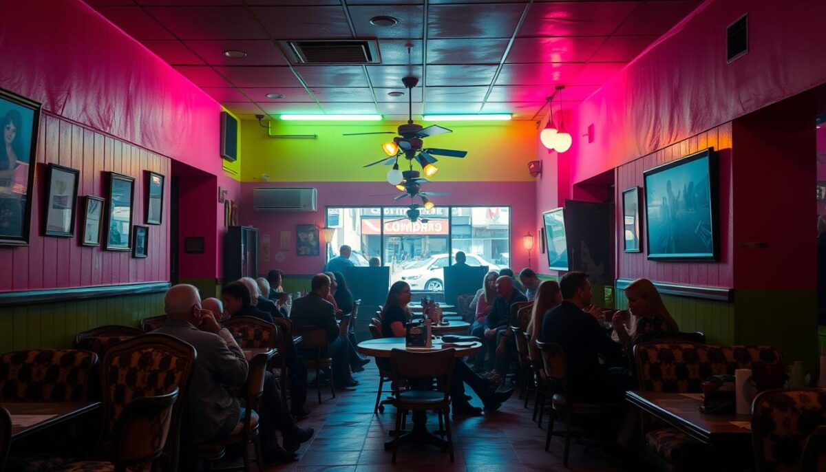
Overly bright or neon colors, such as bright yellow, orange, or green, can create a rushed and anxious atmosphere, bombarding diners and making them uncomfortable. As an expert noted, “We avoid using high-energy colors, such as orange, red, neon colors, etc., as they vibrate to the eye and can be unsettling, especially with food.” These colors can lead to shorter visits and smaller check sizes, negatively impacting your restaurant’s bottom line.
When Breaking the Rules Works
While certain colors are generally best avoided, there are exceptions where they can be used effectively. For example, Just Salad successfully incorporates navy blue into its branding, conveying a sense of relaxation and professionalism. To break the rules successfully, it’s essential to understand the psychological impact of colors and use them thoughtfully. Testing potentially risky colors in small areas before committing to a full design scheme can also help mitigate potential negative effects.
Some key considerations when using potentially problematic colors include:
- Using them as accents rather than primary colors
- Balancing bold colors with neutral tones
- Considering the overall aesthetic and atmosphere you want to create
Strategic Color Application Throughout Your Restaurant
Strategic color application is crucial in creating a cohesive and purposeful customer journey throughout your restaurant. By carefully selecting colors for different areas, you can influence customer behavior and enhance their dining experience.
Entrance and Waiting Areas: First Impressions
The entrance and waiting areas are the first points of contact for your customers. Using colors that create positive first impressions can set the tone for the rest of the dining experience. Warm and inviting colors such as earth tones can make customers feel welcome and comfortable while they wait.
Dining Room: Setting the Mood
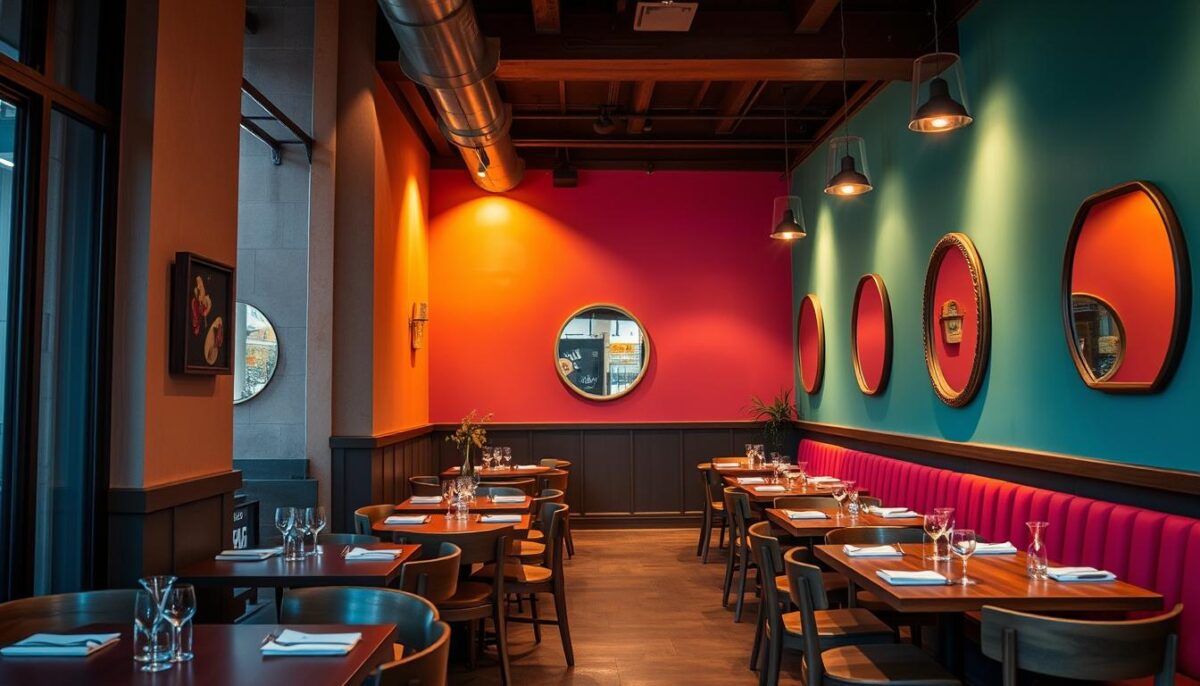
The dining room is where customers spend most of their time, so it’s essential to choose colors that set the right mood. For a lively and energetic atmosphere, consider using bold and vibrant colors. For a more intimate and relaxed setting, softer and muted tones may be more appropriate.
Bar Areas: Creating the Right Energy
Bar areas require a different approach to color selection. To encourage socialization and beverage consumption, consider using colors that stimulate energy and conversation. Bright and bold colors can create a lively atmosphere, making the bar area a hub of activity.
Restrooms: Extending the Experience
Restrooms are often overlooked in restaurant design, but they can play a significant role in creating a lasting impression. Using colors that are consistent with your brand and design theme can extend the dining experience and show attention to detail. Consider using calming colors to create a relaxing atmosphere.
By applying color strategically throughout your restaurant, you can create a cohesive and memorable experience for your customers. This involves careful consideration of the different zones within your restaurant and selecting colors that enhance the overall atmosphere and dining experience.
Using Color to Enhance Your Menu and Food Presentation
Color is a powerful tool in the restaurant industry, influencing not just the atmosphere but also how customers interact with the menu and perceive the food. A strategic use of color can enhance the dining experience, making it more enjoyable and increasing the likelihood of customers ordering more.
Menu Design: Highlighting Profitable Items
When designing a menu, the use of color can draw attention to specific items, particularly those that are most profitable. Warm colors like red, orange, and yellow can stimulate appetite and are ideal for highlighting signature dishes. According to branding expert Brandon Wilkes, using pops of color, such as red text for a particular dish, can subconsciously grab diners’ attention and make them more likely to order it.
Plate and Tableware Selection
The color of plates and tableware can significantly impact the presentation of food. Choosing the right colors can enhance the visual appeal of dishes, making them more appetizing. For instance, vibrant sauces against a neutral backdrop or colorful garnishes on a monochromatic plate can create a visually appealing contrast.
Food Presentation and Garnishing
Food presentation is crucial in creating a positive first impression. Using color strategically on the plate can make dishes appear more appetizing. Consider using colorful garnishes or sauces to add visual appeal. This not only enhances the dining experience but can also justify premium pricing.
Balancing Color with Lighting and Other Design Elements
The harmony between color, lighting, and design elements is key to creating an inviting restaurant atmosphere. While a well-chosen color scheme can set the tone for your dining space, it’s equally important to consider how it interacts with other design elements to create a cohesive experience.
How Lighting Affects Color Perception
Lighting can dramatically alter the perception of color in your restaurant. Warm lighting can enhance warm colors, making them appear more vibrant and inviting. Conversely, cool lighting can make the same colors appear dull or unappealing. To achieve the desired effect, it’s crucial to select lighting that complements your chosen color scheme.
Complementing Colors with Textures and Materials
The textures and materials used in your restaurant’s design can add depth and interest to your color scheme. For instance, combining smooth surfaces with rough textures or pairing matte finishes with glossy ones can create a visually appealing contrast. This balance of colors with textures and materials can make your restaurant space feel more dynamic and engaging.
Seasonal Color Adjustments
Making seasonal adjustments to your color scheme through elements like table linens, artwork, or accent pieces can keep your space feeling fresh without requiring major renovations. These subtle changes can help maintain a welcoming atmosphere and keep your restaurant looking updated throughout the year.
Conclusion: Creating Your Restaurant’s Color Strategy
As you consider the impact of color on your restaurant’s success, it’s clear that a well-thought-out color strategy is crucial. A comprehensive framework for developing a cohesive color palette that aligns with your restaurant’s concept, target market, and business goals is essential.
To refresh your restaurant’s color scheme without a complete renovation, start by testing color changes in small sections. Measure the impact through customer feedback, sales data, and dwell time metrics. Many restaurants have seen measurable improvements in customer satisfaction and profitability after updating their color schemes.
When evaluating your current color scheme, consider how colors impact different aspects of the dining experience and restaurant operations. Color psychology is powerful, but it should be part of a holistic approach to restaurant design that includes quality food, excellent service, and consistent branding. By viewing color as an ongoing strategic consideration, you can keep your space feeling current and engaging with seasonal refreshes and periodic updates.
FAQ
How do I choose the right color palette for my restaurant?
To choose the right color palette, consider the type of cuisine you serve, the atmosphere you want to create, and your brand identity. For example, a fine dining establishment might opt for sophisticated neutrals, while a fast-casual restaurant might use energizing colors like orange and yellow to stimulate appetite.
What colors can suppress appetite?
Blues and purples are often considered appetite suppressants, as they can evoke feelings of calmness and serenity. While these colors can be beneficial in certain contexts, they might not be the best choice for a restaurant where you want to encourage customers to order more.
How can I use color to enhance my menu and food presentation?
You can use color to draw attention to profitable items on your menu by highlighting them in a bold or bright color. Additionally, selecting plate and tableware that complements the colors of your food can create a visually appealing presentation. Garnishing with fresh herbs or edible flowers can also add a pop of color to your dishes.
How does lighting affect color perception in my restaurant?
Lighting can significantly impact how colors appear in your restaurant. For example, warm lighting can make red and orange hues appear more vibrant, while cool lighting can make blues and greens appear more pronounced. Consider the type of lighting you use and how it will interact with your color palette.
Can I use color to influence customer behavior?
Yes, colors can influence customer behavior. For example, warm colors like red and orange can stimulate appetite and encourage customers to order more, while cool colors like blue and green can create a calming atmosphere. By choosing the right colors, you can create an atmosphere that aligns with your brand and encourages customers to behave in a way that benefits your business.
